


Brain Blasterz Launches a Bold New Brand Positioning as the Home of Adventurous Candy
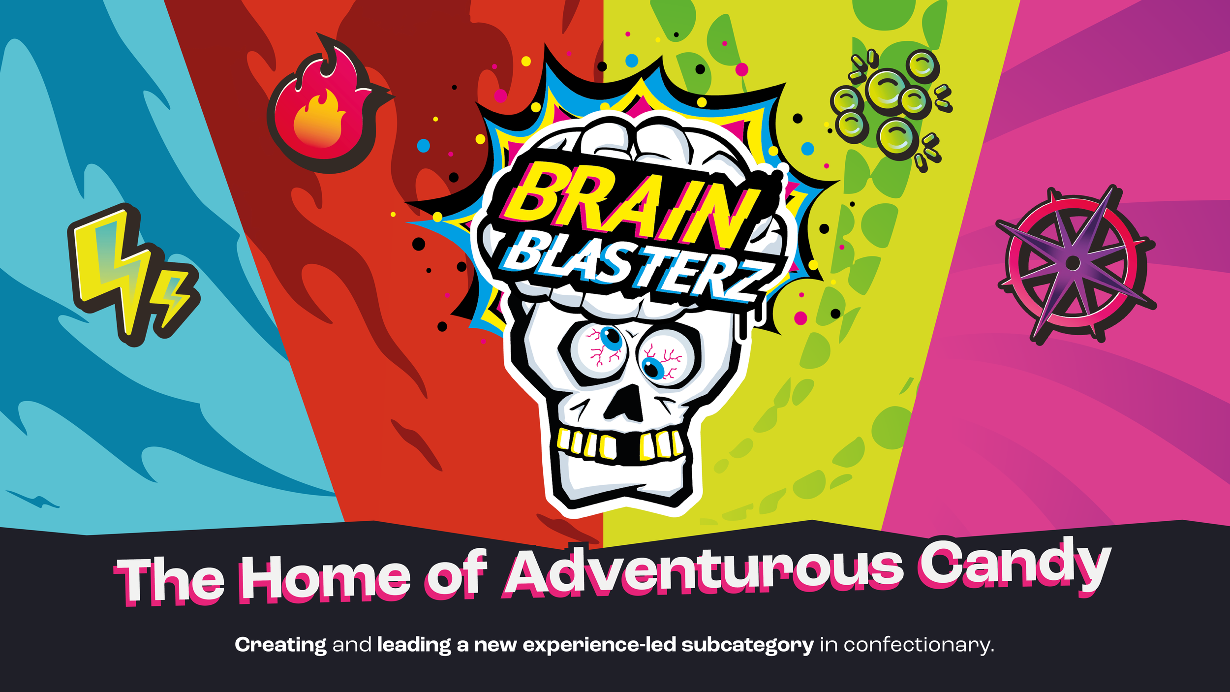
Brand Hatchers has unveiled a bold new brand positioning for Brain Blasterz, officially establishing the brand as the home of adventurous candy.
This evolution marks a shift from product-led messaging to a more experience-driven approach - one that encourages exploration, choice, and playful discovery through flavour.

From Candy to Adventure
The new positioning is built around a simple belief: candy should be more than a treat - it should be an adventure.
Rather than asking consumers to guess what a product might deliver, Brain Blasterz now clearly guides them through flavour experiences designed to suit different levels of curiosity and boldness.
At the heart of this strategy are the brand’s newly introduced Adventure Zones, each representing a distinct type of candy experience:
• Sour Zings – iconic sour flavours with instant impact
• Heat Blasts – fiery flavour experiences for bolder palates
• Texture Trips – multi-sensory candies designed around texture and feel
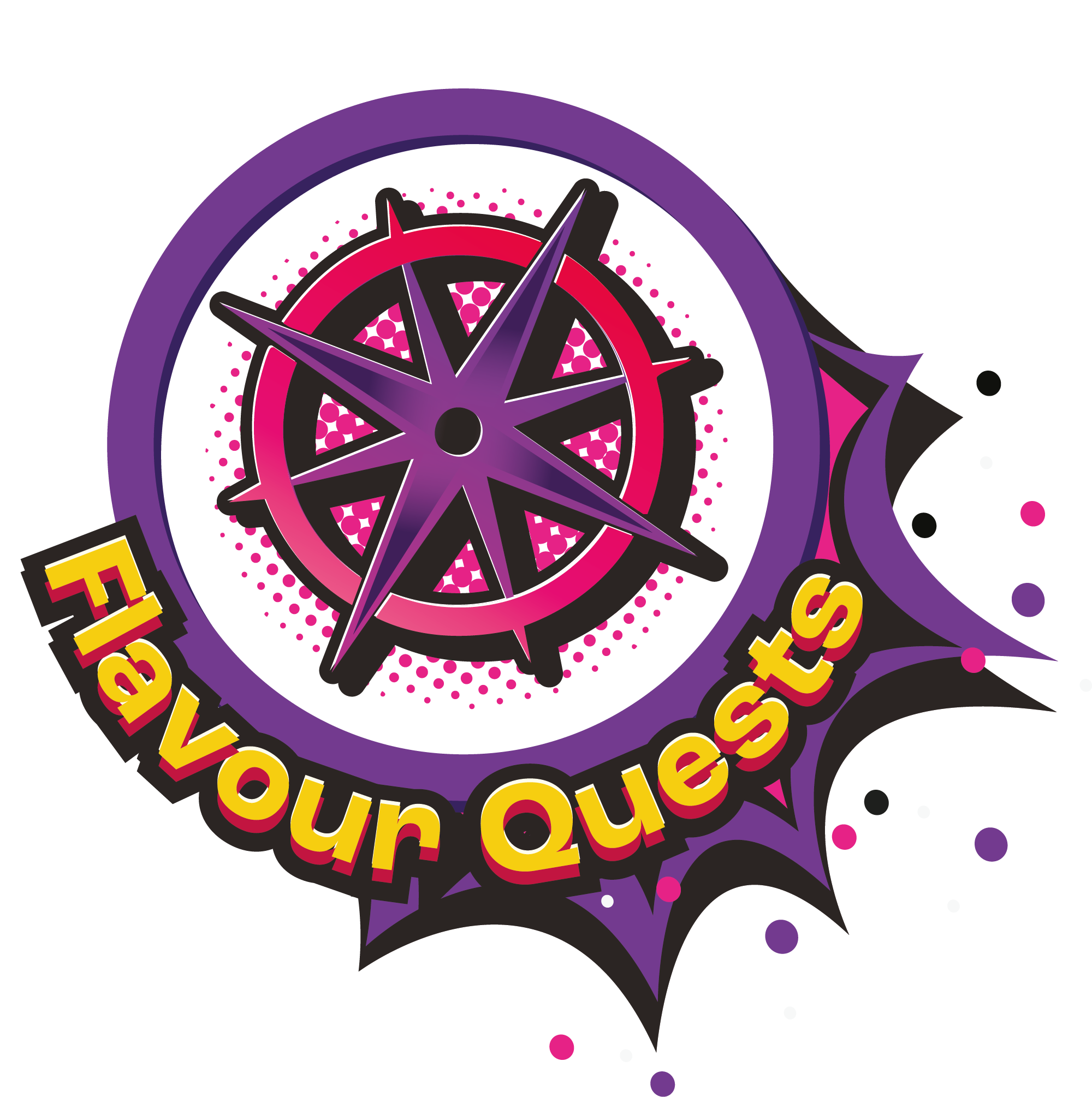
• Flavour Quests – unexpected flavour journeys that surprise and delight
These zones allow consumers to explore Brain Blasterz in a way that feels intuitive, engaging, and personal.


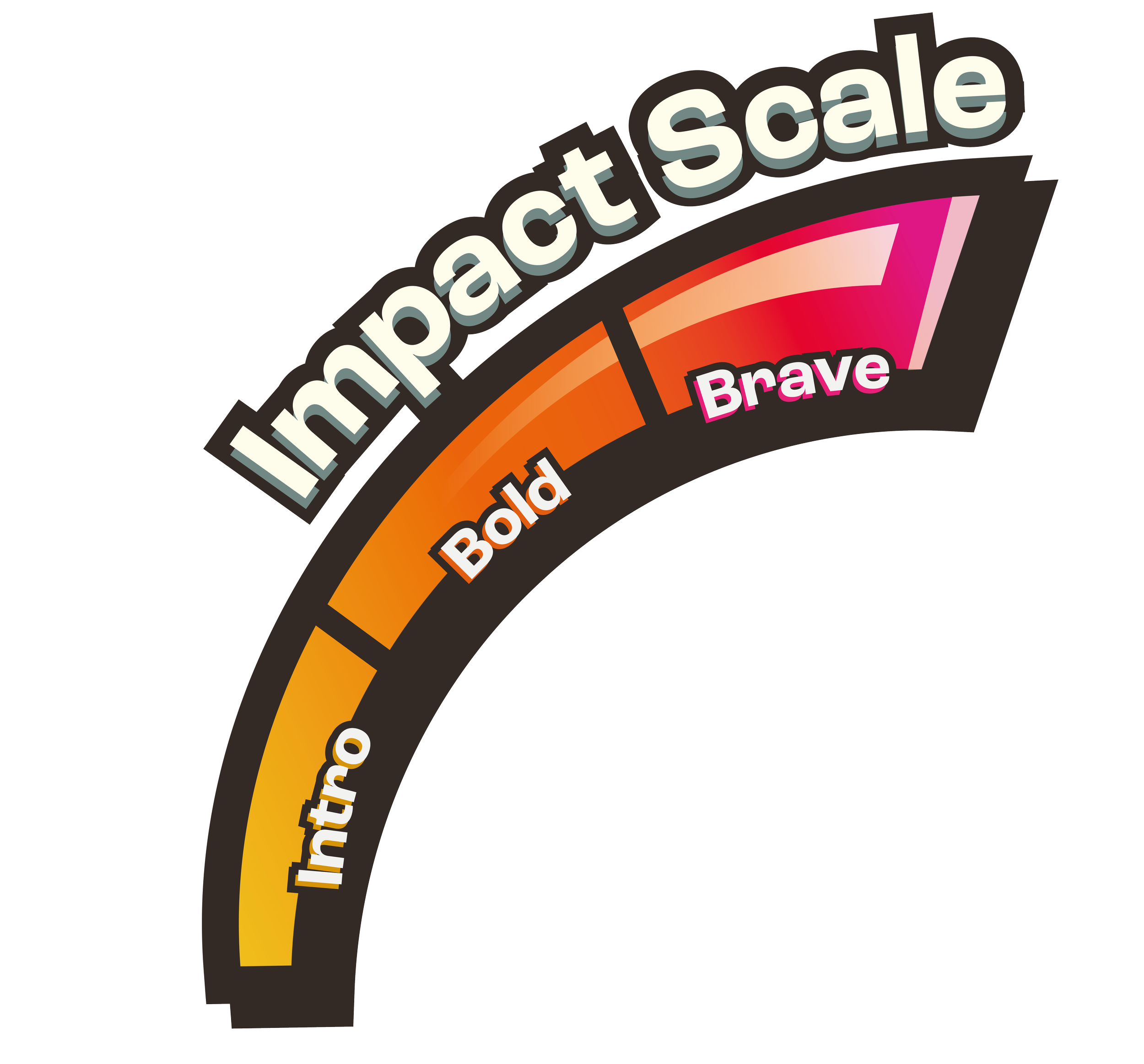
Introducing the Impact Scale
To support this exploration, Brain Blasterz has also launched its Impact Scale - a visual system that shows how bold each candy experience is, from intro to brave.
The Impact Scale empowers consumers to choose their own level of adventure with confidence, removing uncertainty and making experimentation feel accessible rather than intimidating.


A Platform for Growth
Developed by Brand Hatchers, the new positioning provides Brain Blasterz with a scalable platform for innovation, allowing new products to be introduced with clarity and consistency.
By uniting flavour, format, and experience under one clear idea, Brain Blasterz is positioned for long-term growth in a category increasingly driven by discovery, differentiation, and experience-led brands.
The launch of ‘The Home of Adventurous Candy’ marks the beginning of a bold new era for Brain Blasterz - and sets the direction for everything that comes next.